
Saints & Stars
AGENCY | DEVELOPED AT VBAT
ROLE | SENIOR DESIGNER
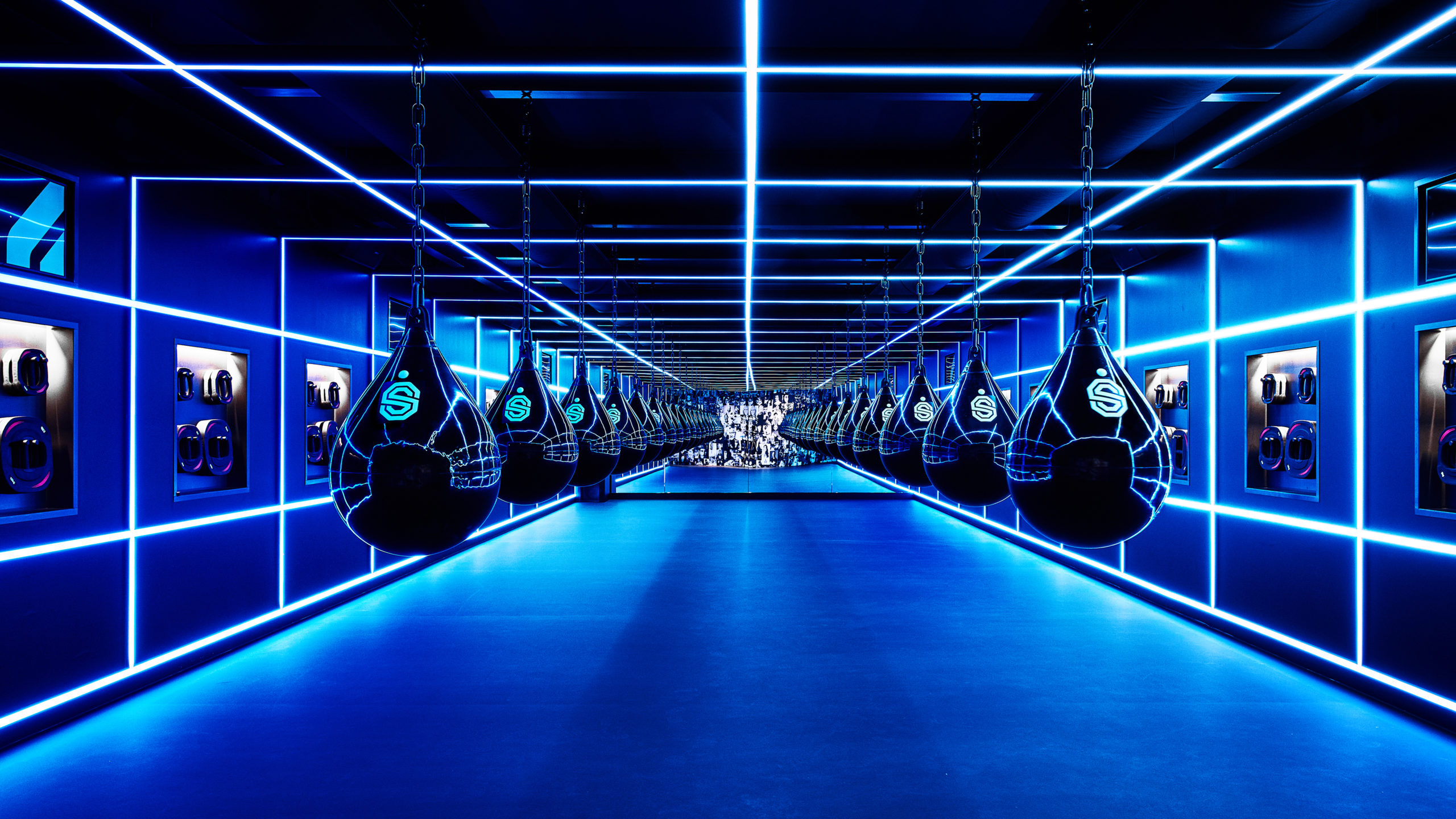
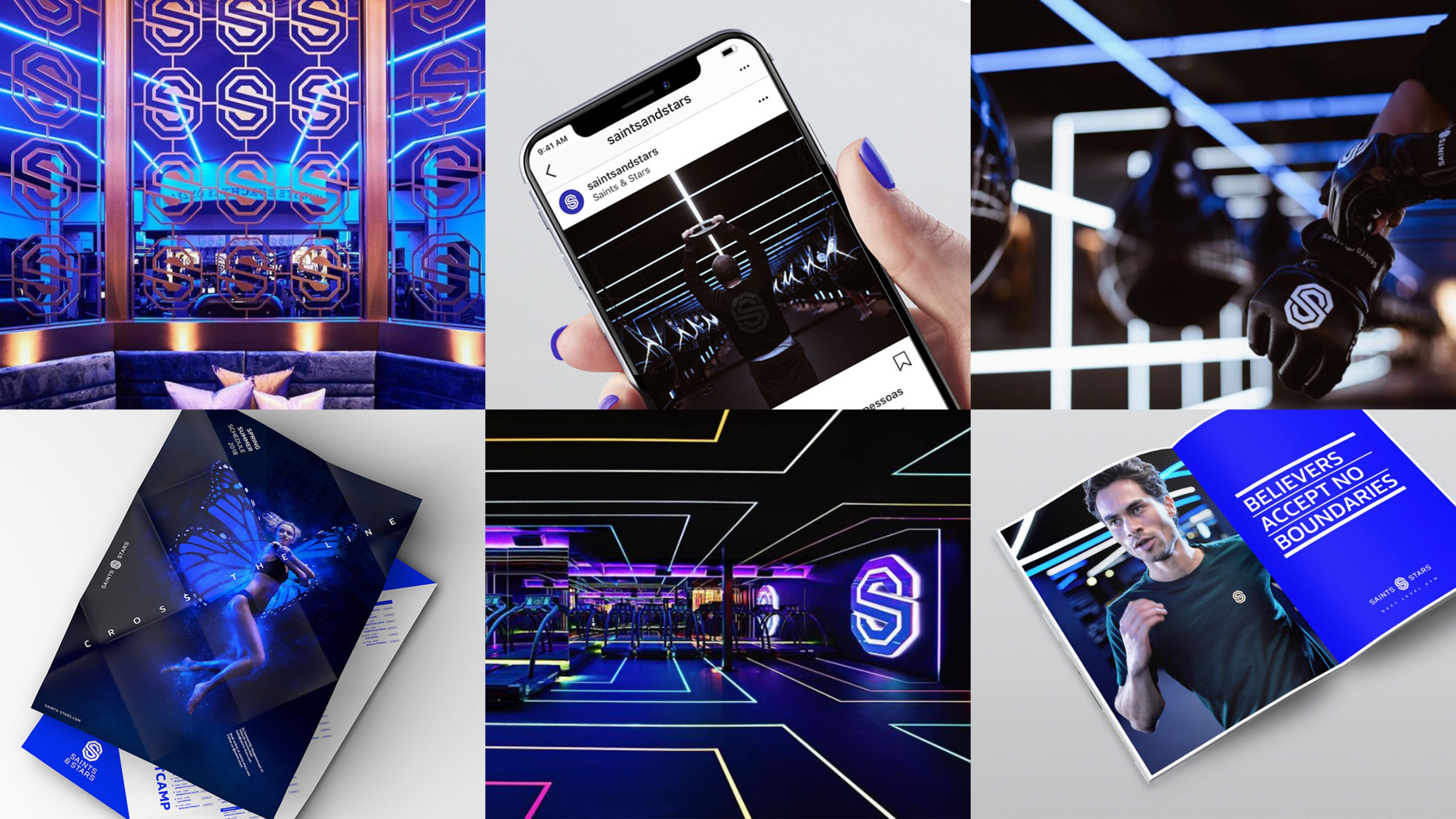
The new Health City urban boutique gym format is not just another average workout place, but ultra-premium fitness experience with upscale amenities and hyper-personalised training.
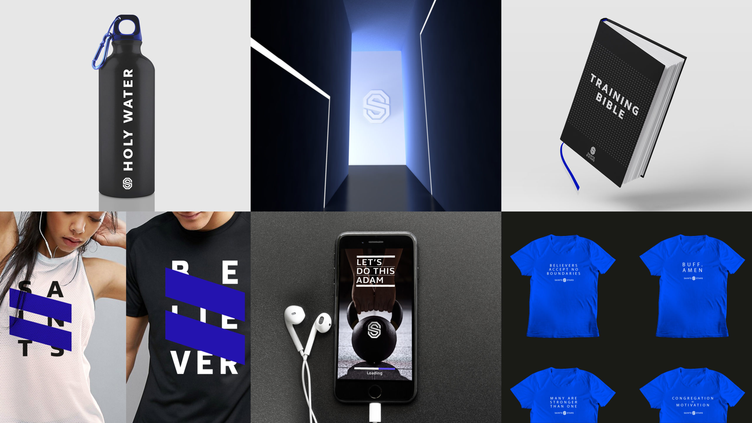
The name Saints & Stars and its brand identity are an irreverent wink towards the (near) religious devotion many urban professionals have for fitness. For these diehards, a gym is a place to be with kindred spirits, a temple that attracts a community of believers whose passion is contagious and self-motivation inspiring.
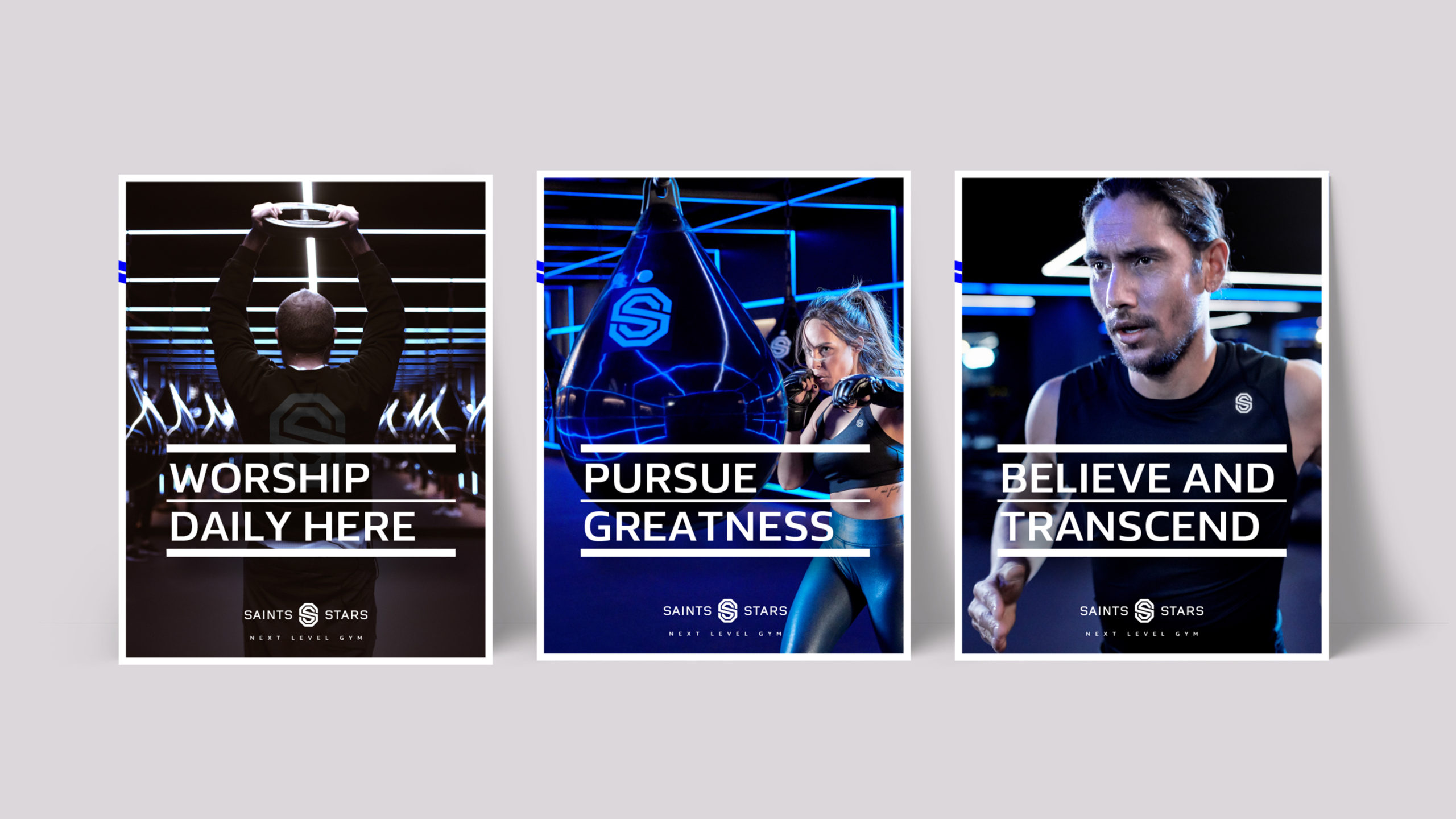
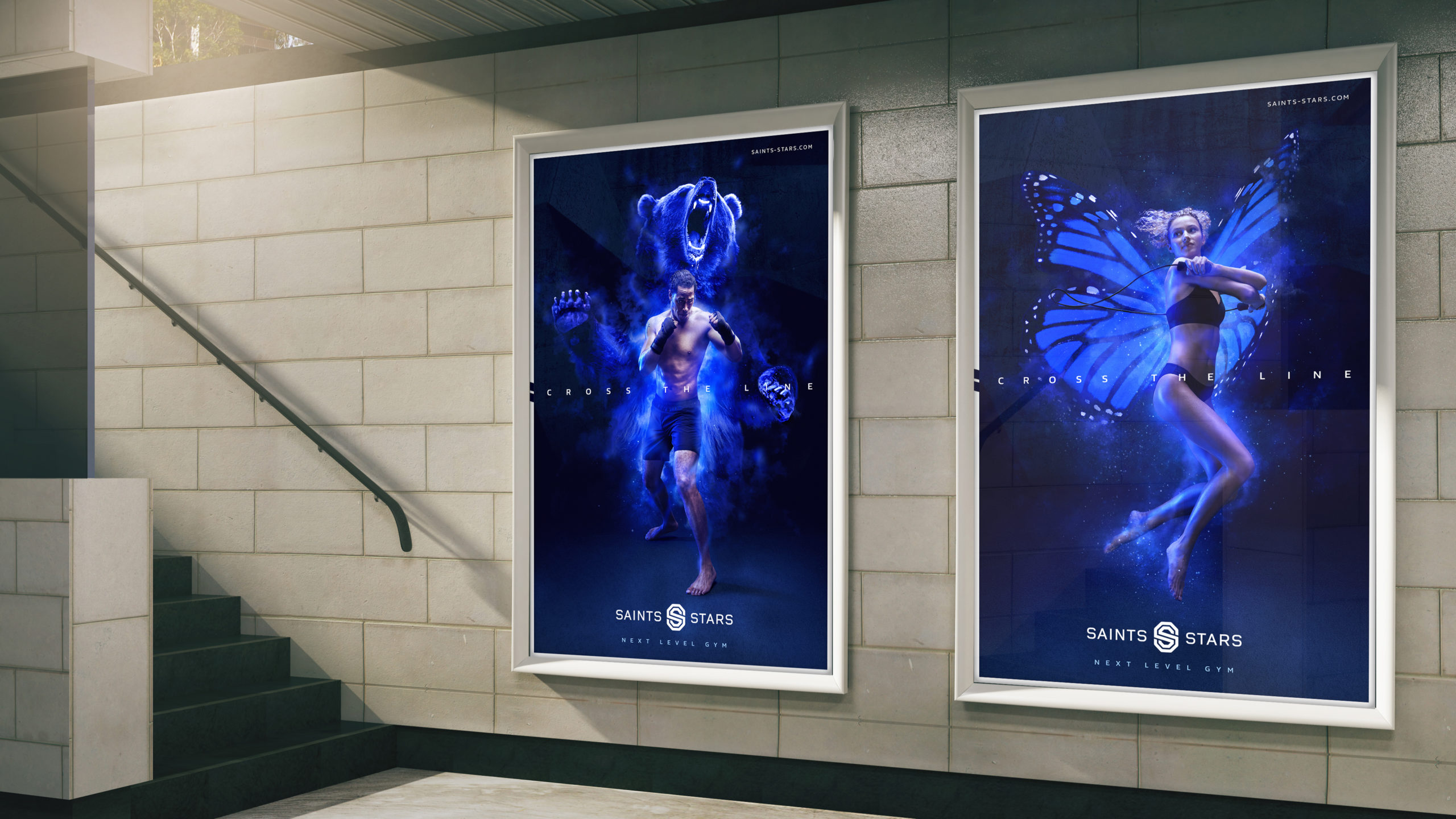
The launch campaign, called ‘Cross the line’, brought all the brand elements together: tone of voice, religious motivation, visual identity and, naturally, that ‘next level fitness’ ethos. Star fitness instructors morphed into their spiritual (totem) animals, focusing on the transformational growth promised by the brand.
BRAND POSITIONING _ BRAND CONCEPT _ BRAND & VISUAL IDENTITY _ BRAND GUIDELINES _ LAUNCH CAMPAIGN _ ACTIVATION
Awards
TRANSFORM AWARDS EUROPE | Silver
Best Visual Identity from the Travel, Leisure and Tourism Sector
WPPED CREAM | Highly Commended
Design & Branding
GRAPHIS AWARDS | Gold
Poster Category